Display parameters
Slider theme
Starting from UI library version 21.1000.100 you can manage slider theme.
| Parameter | Type | Default | Description |
|---|---|---|---|
POPUP_COMPONENT_USE_BITRIX24_THEME | string | null | Parameter includes use of account themes in slider when passing as 'Y'.
Needed to use other theme parameters. By default (without using other theme parameters) slider opens with the theme, set at user's account. |
THEME_ID | string | null | Sets slider theme. Slider will always be opened with the specified theme. |
DEFAULT_THEME_ID | string | null | Replaces 'default' (Bitrix24) theme to a newly specified. It means that slider is opened with the theme, set at user's account, replacing the default theme. |
Example
Module uses email. An email is opened with theme from user's account. Default theme is replaced with special email theme for opened slider of открывается с темой, установленной у пользователя на портале, но в случае дефолтной темы слайдер загружается с особой почтовой темой вместо серой дефолтной.
$APPLICATION->IncludeComponent(
	'bitrix:ui.sidepanel.wrapper',
	'',
	[
		'POPUP_COMPONENT_USE_BITRIX24_THEME' => 'Y',
		'DEFAULT_THEME_ID' => 'light:mail',
		'POPUP_COMPONENT_NAME' => $componentName,
		'POPUP_COMPONENT_TEMPLATE_NAME' => '',
		'POPUP_COMPONENT_PARAMS' => $arResult,
		'USE_UI_TOOLBAR' => 'Y',
		'USE_PADDING' => false,
		'PLAIN_VIEW' => false,
		'PAGE_MODE' => false,
		'PAGE_MODE_OFF_BACK_URL' => "/stream/",
	]
);
Editing title inside the header
| Parameter | Type | By default | Description |
|---|---|---|---|
EDITABLE_TITLE_DEFAULT | string | null | Title by default. |
EDITABLE_TITLE_SELECTOR | string | null | Element selector with input that hides the field. |
For example, a page has a field for title. It's editing can be moved to header. The field is then hidden, header is updated with a pencil symbol near it.
When clicking on a pencil, title now can be edited. Hidden input also receives input value:
Button display
| Parameter | Type | By default | Description |
|---|---|---|---|
BUTTONS | array | [ ] | When slider opens a grid, it makes sense to add a panel with "Close" button to the page bottom. However, grid page should not show "Close" button via direct link.
To implement it, pass the value |
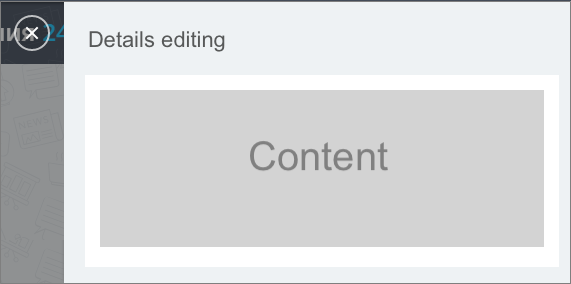
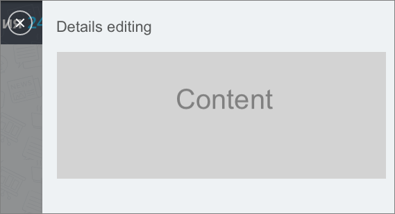
Content display
Disabling the padding
| Parameter | Type | By default | Description |
|---|---|---|---|
USE_PADDING | boolean | true | Padding is enabled for content by default. |
Example: image has padding - white background and grey - is content.
Pass USE_PADDING=false, to disable padding for content:
Displaying only content without header
| Parameter | Type | By default | Description |
|---|---|---|---|
PLAIN_VIEW | boolean | false | Parameter allows displaying content without header. Disabled by default. |
Example: with PLAIN_VIEW=true, content is disabled without slider padding (content padding remains) and header:
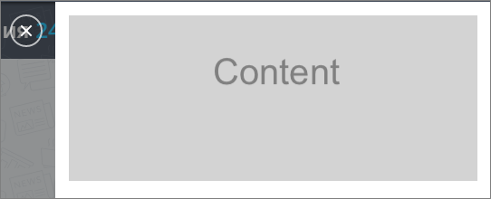
Removing all padding, leaving only content: combine parameters PLAIN_VIEW=true and USE_PADDING=false.

Example
Page is opened from grid. Close after saving and updating the grid:
$APPLICATION->IncludeComponent(
    'bitrix:ui.sidepanel.wrapper',
    '',
    [
        'POPUP_COMPONENT_NAME' => 'bitrix:crm.button.edit',
        'POPUP_COMPONENT_TEMPLATE_NAME' => '',
        'POPUP_COMPONENT_PARAMS' => [
            'PATH_TO_BUTTON_LIST' => $arResult['PATH_TO_BUTTON_LIST'],
            'PATH_TO_BUTTON_EDIT' => $arResult['PATH_TO_BUTTON_EDIT'],
            'PATH_TO_BUTTON_FILL' => $arResult['PATH_TO_BUTTON_FILL'],
            'PATH_TO_USER_PROFILE' => $arResult['PATH_TO_USER_PROFILE'],
            'ELEMENT_ID' => $arResult['VARIABLES']['id']
        ]
        'CLOSE_AFTER_SAVE' => true,
        'RELOAD_GRID_AFTER_SAVE' => true,
    ]
);