Last Modified: 12.10.2021
|
|
|
Views: 4744
Last Modified: 12.10.2021
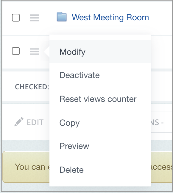
Each system element can be customized: a news item - edited, product description - updated, page SEO parameters changed, discount created, module parameters configured and etc. Edit form appears upon clicking on
Modify
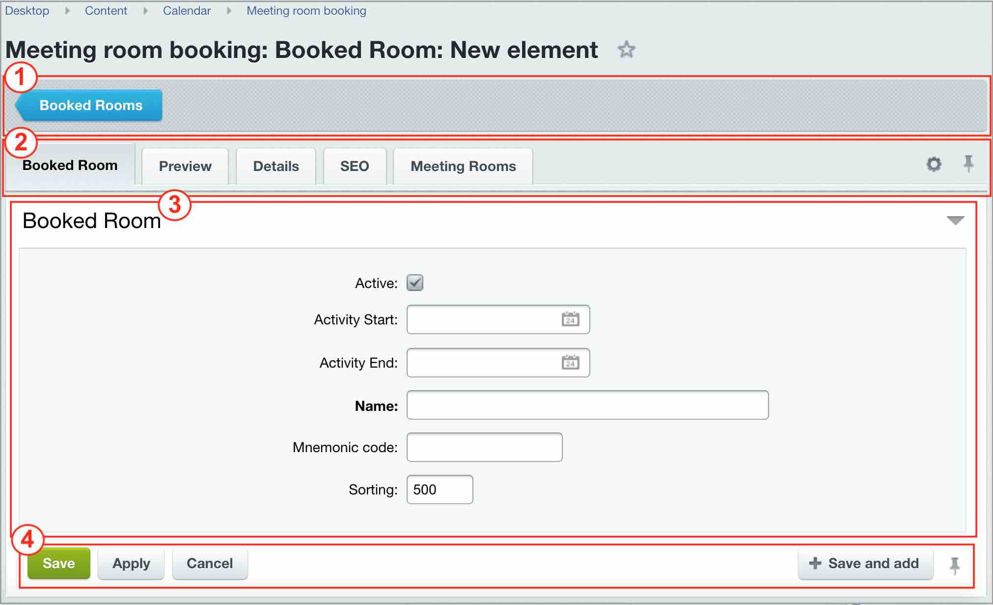
Edit form common contents1 - Context panel. Its contents can vary, depending on the form. However, all panels have a button that returns to list of elements. 2 - Tabs area. Edit forms can have a large number of customizable properties, that's why similar fields are collected into logical groups and are displayed as tabs. Usually, properties are grouped in a manner that first property pages (in a sequence from left to right) list the most used and the last pages - other, additional parameters. All form fields can be viewed in a single tab (or returning to tab mode) via
triangle button
Despite using tabs, field area can be significantly large, without fitting into a single screen. Use the
pin button
External form appearance can be configured as well: number of tabs and fields can be modified (such feature is not available for all edit forms) and rolled back by default via
gear button
3 - Field area. Displays fields for editing. 4 - Action panel.
Despite the variety of edit forms, they share common attributes. Edit forms are configured for specific work conditions.
Courses developed by Bitrix24
|


